NewsletterIssue 0
Sent 5 Nov 2026
Issue 0
Editor's note
I've always wanted to keep up with the foundries I admire. With two young kids, I mostly rely on the algorithm and luck. The Release Type newsletter is me going looking on purpose, once a week. It's for me first. If it's useful to you too, even better.
1. Brite by Scotch-Brite
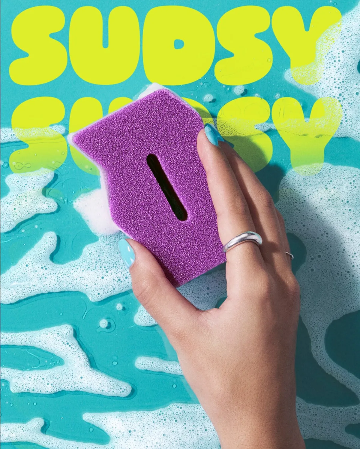
- Design: Katlyn Echeverri, 3M (in-house)
- Fonts In Use
- Stack: OHNO Softie + Poppins
Kids party. That's what Softie does for Brite by Scotch-Brite: elastic, bouncing, chocolate-cake joyful, with Poppins doing the sensible talking. I used to love type that stayed quiet in the background, Swiss and more Swiss. OHNO cured me of that. I want these sponges.
See also: Ozik Soft by Nuform Type.
2. Nordi
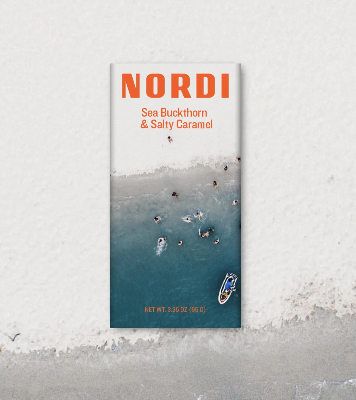
- Design: Redscout
- Fonts In Use
- Stack: custom Nordi wordmark (Redscout) + Knockout
The wordmark is custom; Knockout supports. Knockout was one of my first loves. I typeset my first magazine in it, borrowing liberally from the NYT Magazine of the time. The versatility. The condensed solidity, standing tall. In the heavier weights, all caps, it's a true beauty: refined but punchy. It can play support. It can also steal the show. It's a character actor, a Paul Giamatti. I love Paul.
New releases
- Spectator by Commercial Type (Paul Barnes). commercialtype.com/news/spectator. I've always had a soft spot for revivals. We're never far from our type ancestors. My favourite part of Spectator is the capital R in the Deck cut, a confident, strong flourish.
- Store Norske Skrik by Store Norske Skriftkompani (Arve Båtevik). skriftkompani.no/typefaces/skrik. I tried to design something like Skrik once. Building in quirk is harder than it looks. It reads as geometric but isn't quite, and the lowercase a, tapering into its stem, is kind of wonderful.
- GD Praxio by GD Foundry (Marcus Gärde, Anders Wikström). foundry.gardedesign.se/typefaces/gd-praxio. Semi-serif is a bit of an unusual classification, which is what drew me to GD Praxio. Big, it's a strong, confident display face, and the thin middle bar of the 3 is a thing of beauty. Small, it does what it was drawn for: carrying long medical copy on screen. Any typeface that does both that well deserves plaudits.
- Alas by Herzberg Design Co. herzbergdesign.com/fonts/alas. These letterforms are wafts of smoke. Dreamy. I could look at the floral flourishes on the capitals all day.
From the bench
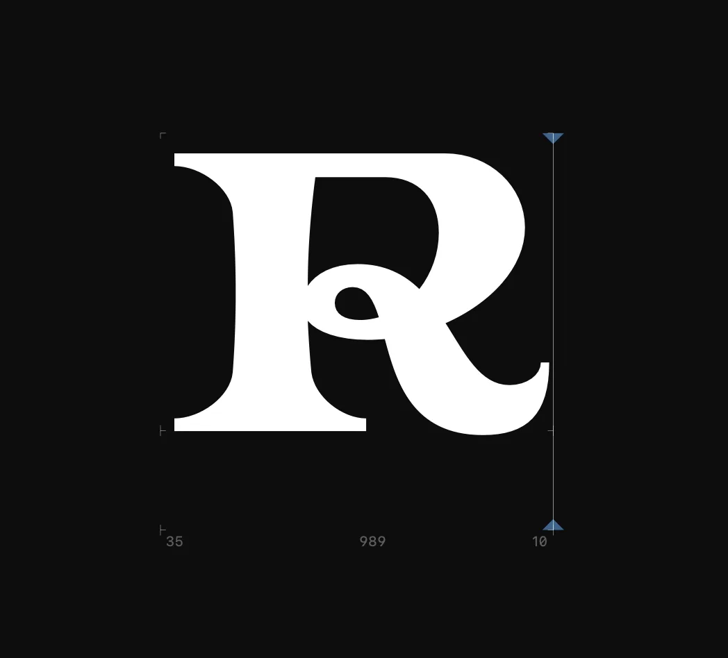
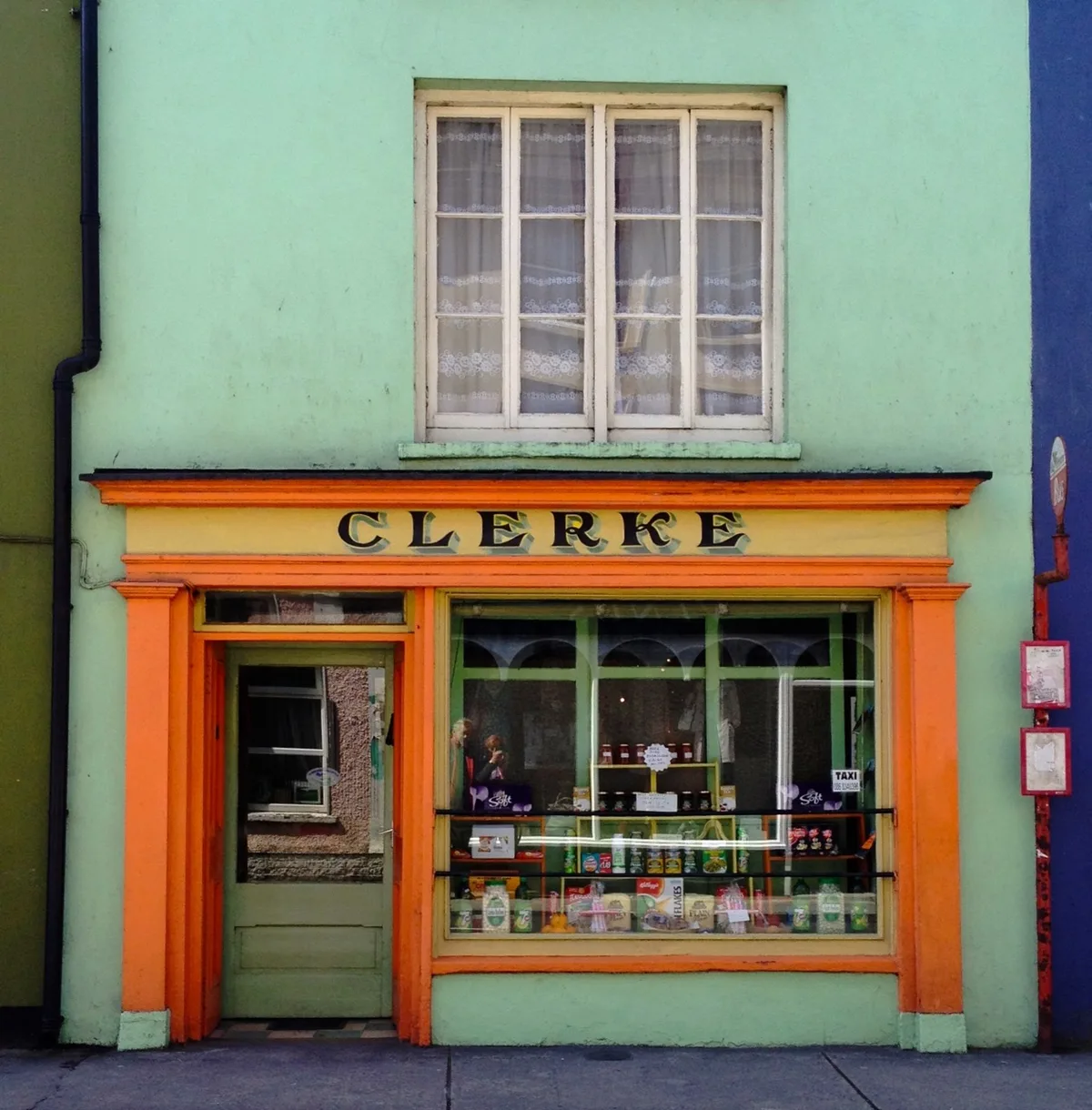
This is the R from a typeface I am working on. It's based on a sign-painted storefront I came across. I loved the loop in the middle of the R and K in particular.
Sign-off
That's it for this week. See you next Thursday with whatever I find.
Dargan
Images are shown for review and credited to their owners. If one is yours and you would like it removed, email hello@releasetype.com.