NewsletterIssue 1
Sent 11 Nov 2026
Issue 1
I'm in Portugal for work this week, which got me thinking about Portuguese type designers. I'm reluctant to admit I couldn't name any. So I did some digging, and was delighted to find a lovely revival in Altiora, and a different way of thinking about revivals in Statius: start with a classic and remove its most iconic letters. I also stumbled on an archive of Portuguese ephemera, which is always a nice internet treasure trove to come across. I've been coming to Lisbon for about ten years. It's been nice to dip into its type culture, and I understand the city a smidge better than I did last week.
Lisbon angle: José Leite
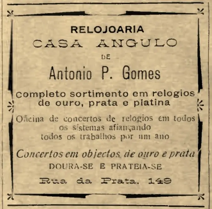
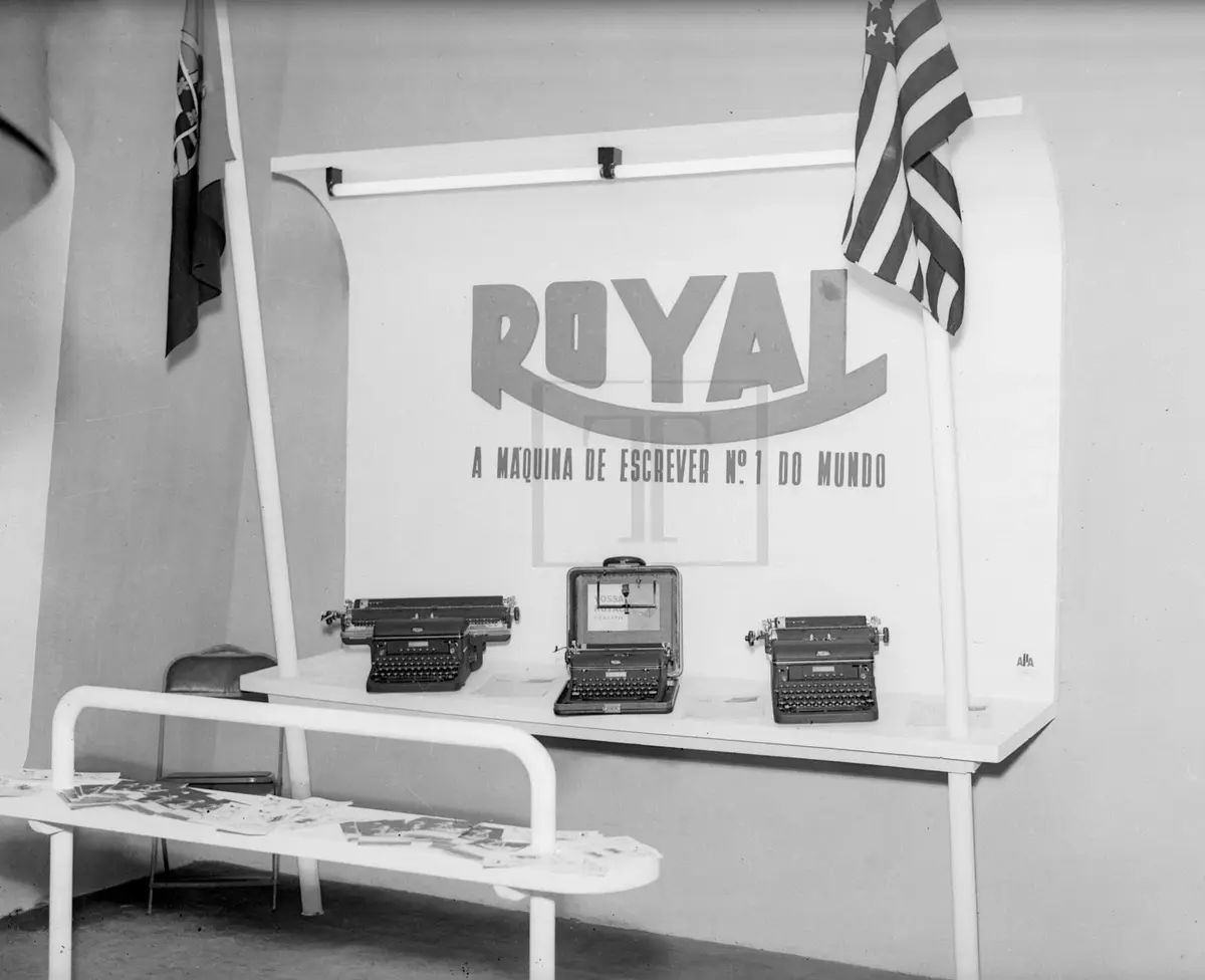
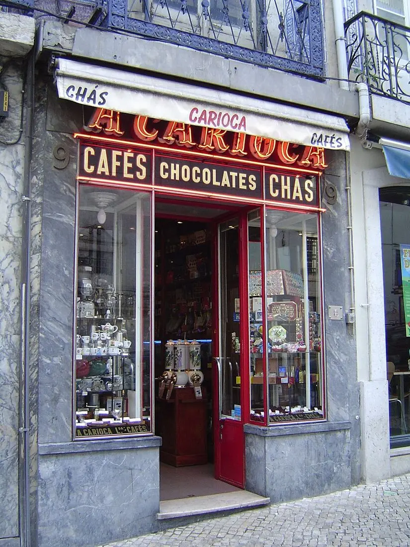
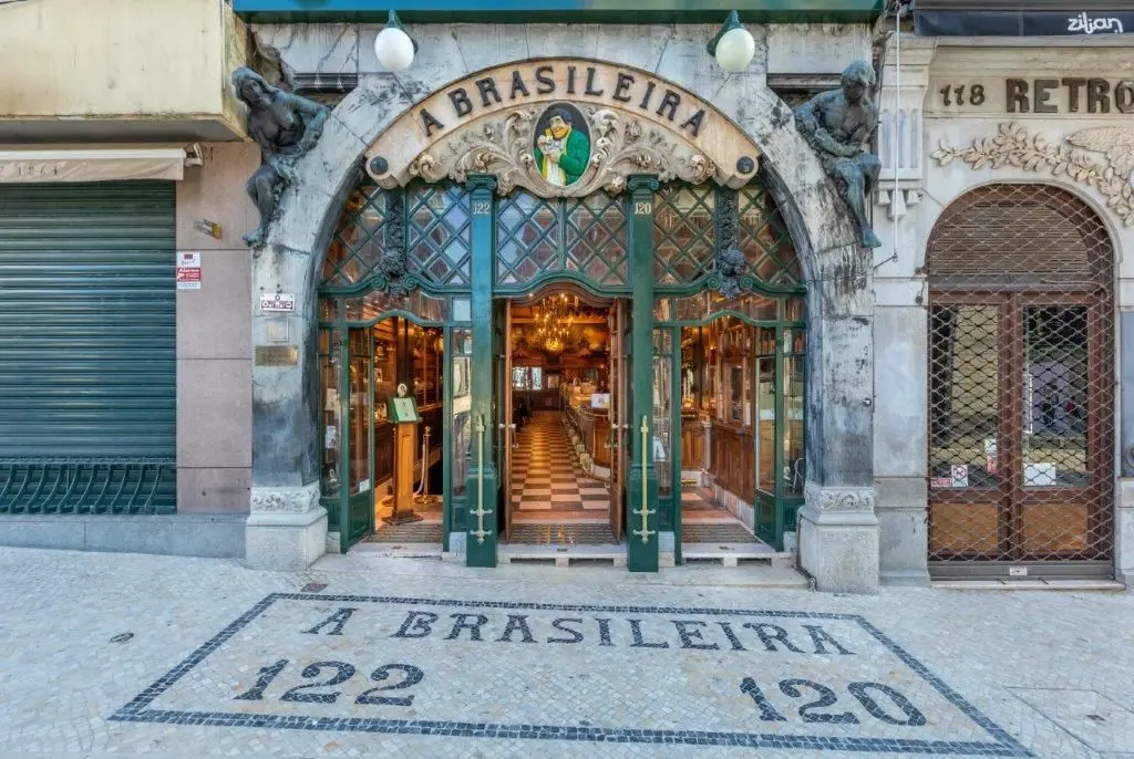
José Leite isn't a type designer. Since 2009 his blog, Restos de Colecção, has been gathering Lisbon's ephemera: old ads, shop fronts, photographs and newspaper cuttings. As a designer I get an odd joy from this stuff. Archives like his are gold mines for ideas, and they feed my curiosity about what the world looked like at street level. Walk through Lisbon and you can still see what's left of it, more so than in Irish towns and cities. And some of it is beautiful old typesetting. I love the light, wide capitals of CASA ANGULO in this ad for a watchmaker on Rua da Prata.
Shop fronts
New releases
Imenso by DSType (Pedro Leal, Dino dos Santos). Released 6 Nov 2026. dstype.com/next-fonts/imenso
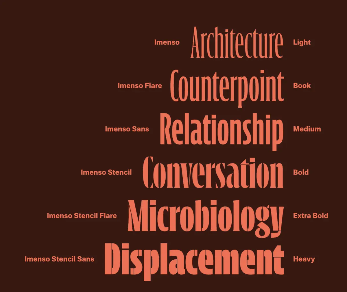
Imenso has real strength, and grace too. I keep going back to Imenso Flare in the lighter weights, Light and Book, which have a beautiful presence. Look at the N: its stems taper like needles, or golf tees. The contrast is beautifully handled, especially where thick turns to thin. I thought it lost something in the heavier weights, but the Bold holds up.
Altiora S by R-Typography. 2026. r-typography.com/fonts/altiora-l
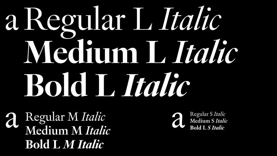
I always love a good revival. Altiora brings back the types Jean Villeneuve cut in 1732 for the Royal Academy of Portuguese History, and it's a delicate thing. The bowl of the a droops, though not in a sad way: it's more like a delicate drop. The head serif of the i is sharp, and the leg of the R is like a fox's tail, sharp and soft at the same time. Particularly lovely in the Regular and Medium.
Gradine by DSType (Dino dos Santos, Pedro Leal). Released 10 Jun 2026. dstype.com/fonts/gradine
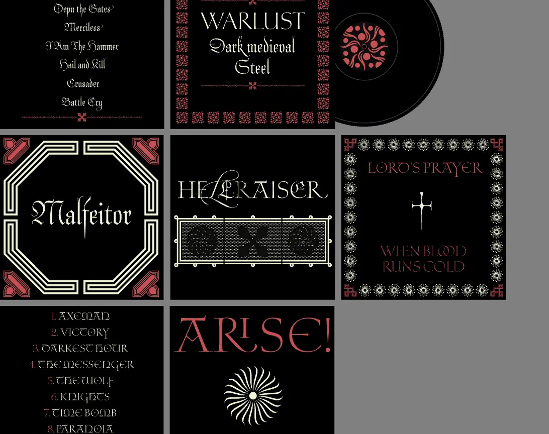
Gradine is near impossible to categorise: it's several styles at once, a buffet of delight. The Antiqua says Lord of the Rings, or medieval Ireland, in a weird way, and its M is lovely. The Script's flourishes, especially on the capital L, are lovely too, and a script that doesn't feel clichéd is hard to pull off. The Incised is something else entirely, like it's cut from stone for a grand tombstone in an old graveyard. And then there's the Blackletter M. There's more on the table than one plate can hold, so go back for seconds.
Statius by Feliciano Type (Mário Feliciano). 2025. felicianotype.com/typefaces/statius
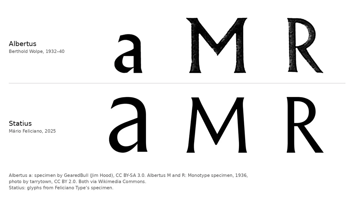
Statius isn't brand new, but I wanted it here for Feliciano's method. He started with Albertus, one of the best-known display faces there is, then drew it from memory and dropped its most memorable letters: the lowercase a, the M and the R. Making something memorable without the very letters that made the original memorable is a lovely puzzle. Type design is a bit of a puzzle anyway, a visual puzzle of balance and optics. It got me wondering what Futura would be without its pointed M, or Gill Sans without its g. And drawing from memory means the original gets filtered through the designer: their life, and what they have or haven't been looking at lately. The typeface is lovely, but the method is what drew me in.
Sign-off
That's it for this week. See you next Thursday with whatever I find. Até já.
Dargan
Images are shown for review and credited to their owners. If one is yours and you would like it removed, email hello@releasetype.com.